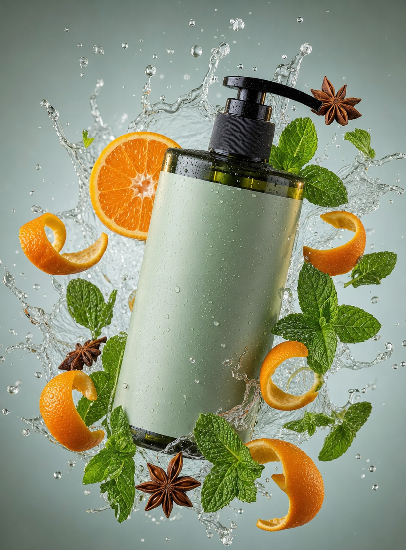
Why this works
The phrase “sleek pump bottle with a magnesium body wash label, suspended in a vivid water splash” establishes the product as the focal point while “centered composition” keeps the layout symmetrical and packaging-led. “Sharper droplets and stronger upward motion” supplies the energetic sense of movement, while “orange peel curls, fresh mint sprigs, and star anise pods” directly supports the orange, green, and dark accent colors visible around the bottle. “Soft cool-gray/seafoam gradient background” and “crisp reflections, cool highlights” create the clean, premium atmosphere by separating the dark packaging and bright white water from the botanical colors.
FAQ
→How do I make the bottle feel more dominant and luxurious?
Replace “centered composition on a soft cool-gray/seafoam gradient background” with “large bottle occupying most of the frame, centered with generous negative space, luxury beauty-ad composition.” Change “suspended in a vivid water splash” to “bottle sharply isolated in a controlled low splash beneath the pump,” so the water supports rather than competes with the packaging.
→How do I make this prompt feel calmer and more botanical?
Replace “sharper droplets and stronger upward motion” with “slow, glasslike water arcs with minimal droplets,” and replace “energetic fresh premium mood” with “quiet, spa-like premium mood.” Keep “fresh mint sprigs” but increase that element with “abundant mint leaves and delicate botanical spacing,” while reducing “star anise pods” to “one subtle star anise accent.”
→How do I build a series of scent variations from this design?
Keep “sleek pump bottle,” “centered composition,” and “clean modern packaging mockup” unchanged, then replace “orange peel curls, fresh mint sprigs, and star anise pods” with a fixed botanical trio for each scent. For example, use “lemon peel curls, rosemary sprigs, and cedar chips” for a crisp woody variant, or “grapefruit wedges, eucalyptus leaves, and juniper berries” for a sharper aquatic variant; match each set with a new “soft cool-gray/seafoam gradient” such as “pale blue-gray and icy lavender gradient.”
Learn the technique behind this
- Why can't AI spell, and how do I get readable text in an image? — Older diffusion models had no character-level representation of text, so they produced letterform-shaped texture instead of words.
- How should a prompt be structured, and does word order matter? — A prompt that behaves predictably names one subject first, then what it is doing, then where, then the light, then the lens or medium, then the style.
- Which aspect ratio should I use, and how does it change the image? — Aspect ratio determines what the model composes, not how it's cropped afterwards.
Related prompts

Playful brunette beauty ad portrait

Red Lip Balm with Lychee Freshness

Premium wellness pouch with golden spices

Teal-Accented Bunny Toy Studio Portrait
