Why this works
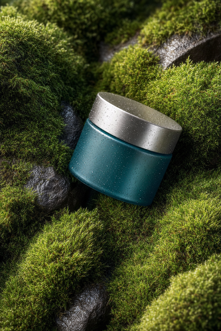
The centered jar and “near top-down but slightly side-angled composition” make the packaging the immediate focal point while still showing the moss-covered rocks as context. “Deep teal cosmetic packaging with a brushed-silver lid” supplies the dominant teal-and-gray contrast, and “natural earthy color palette” connects those cool product tones to the black-green moss. “Soft diffused morning light” produces the restrained premium mood, while “realistic shadows fall across the moss” adds depth without breaking the minimal modern eco aesthetic. “Ultra-fine label texture,” “sharp focus,” and “gentle background falloff” keep the image tactile and commercial rather than flat or purely illustrative.
FAQ
→How do I make the cream jar feel more luxurious and visually dominant?
Replace “lush moss-covered rocks” with “a single smooth dark stone with sparse moss accents,” and change “centered” to “large centered hero composition with the jar occupying most of the frame.” Strengthen “brushed-silver lid” to “mirror-polished brushed-silver lid with crisp controlled highlights,” and replace “soft diffused morning light” with “soft directional studio light with a refined rim highlight.”
→How do I make the image warmer and more organic while keeping the premium product look?
Replace “deep teal cosmetic packaging” with “muted sage-green cosmetic packaging,” and change “natural earthy color palette” to “warm earthy palette of sage, clay, sand, and deep olive.” Swap “soft diffused morning light” for “warm golden-hour diffused light,” while retaining “ultra-fine label texture” and “premium product photography” to preserve the polished finish.
→How do I create a series of variations without losing the same skincare campaign identity?
Keep “luxury skincare cream jar,” “deep teal cosmetic packaging,” “brushed-silver lid,” “premium product photography,” and “sharp focus with a gentle background falloff” unchanged. For each variation, replace only “moss-covered rocks” with settings such as “wet river stones,” “pale limestone surrounded by lichen,” or “minimal travertine pedestal with scattered moss,” then vary “near top-down but slightly side-angled composition” to “low three-quarter angle” or “straight-on centered composition.”
Learn the technique behind this
- Why can't AI spell, and how do I get readable text in an image? — Older diffusion models had no character-level representation of text, so they produced letterform-shaped texture instead of words.
- How do I keep one consistent style across a whole set of images? — Style consistency is more achievable than character consistency because style lives in describable attributes.
- How should a prompt be structured, and does word order matter? — A prompt that behaves predictably names one subject first, then what it is doing, then where, then the light, then the lens or medium, then the style.
Related prompts

Playful brunette beauty ad portrait

Red Lip Balm with Lychee Freshness

Premium wellness pouch with golden spices

Teal-Accented Bunny Toy Studio Portrait
