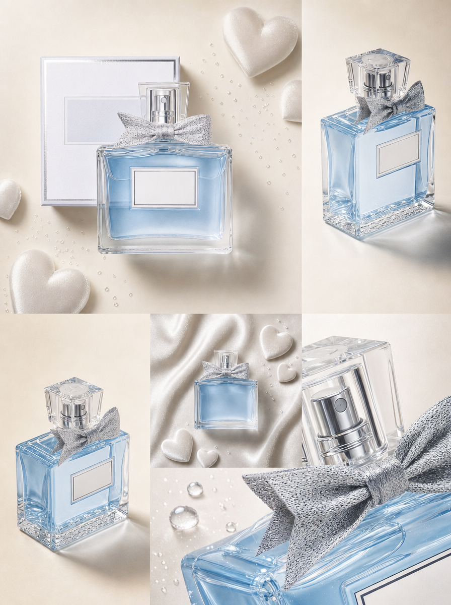
Why this works
The centered composition is anchored by “a centered front hero shot,” while the surrounding three-quarter, top-down, and macro views create a structured editorial rhythm without breaking the bottle’s identity. “Soft cool pastel palette of icy blue and pearl white” and “pale satin” produce the dominant blue, beige, and gray harmony, while “soft diffused light,” “gentle shadows,” and “realistic reflections and specular highlights on glass” keep the romantic mood polished rather than theatrical. “Modern seamless borderless collage” and “smooth blending transitions between images” are the load-bearing phrases behind the continuous, premium e-commerce presentation.
FAQ
→How do I make the bow and bottle neck more prominent across the collage?
Replace “a macro close-up of the bottle’s neck, bow, and glass” with “an oversized macro tile centered on the bow knot and bottle neck, with the bottle body partially cropped,” and change “same bottle identity” to “same bottle identity, bow clearly visible in every tile.”
→How do I shift the mood from soft romantic to darker, more dramatic Valentine styling?
Replace “soft cool pastel palette of icy blue and pearl white” with “deep burgundy, midnight blue, and silver,” and replace “soft diffused light, delicate gentle shadows” with “directional low-key side-lighting, deeper shadows, and crisp highlights.” Change “subtle heart-shaped accents” to “small black and burgundy heart-shaped accents” to retain the theme without adding text.
→How do I create a matching series with different perfume colors while preserving this layout?
Keep “five editorial product photos” and the five listed camera views unchanged, then replace “light-blue perfume bottle” and “icy blue and pearl white” with a controlled variant such as “rose-gold perfume bottle” and “blush pink and warm ivory.” Retain “same bottle identity,” “cohesive color grading,” and “smooth blending transitions between images” so only the product color and palette change.
Learn the technique behind this
- Why can't AI spell, and how do I get readable text in an image? — Older diffusion models had no character-level representation of text, so they produced letterform-shaped texture instead of words.
- Why does the model ignore parts of my prompt? — Ignored instructions are almost always conflicts, counts, or spatial relationships — three things current models handle badly — rather than the model failing to read you.
- How should a prompt be structured, and does word order matter? — A prompt that behaves predictably names one subject first, then what it is doing, then where, then the light, then the lens or medium, then the style.
Related prompts

Playful brunette beauty ad portrait

Red Lip Balm with Lychee Freshness

Premium wellness pouch with golden spices
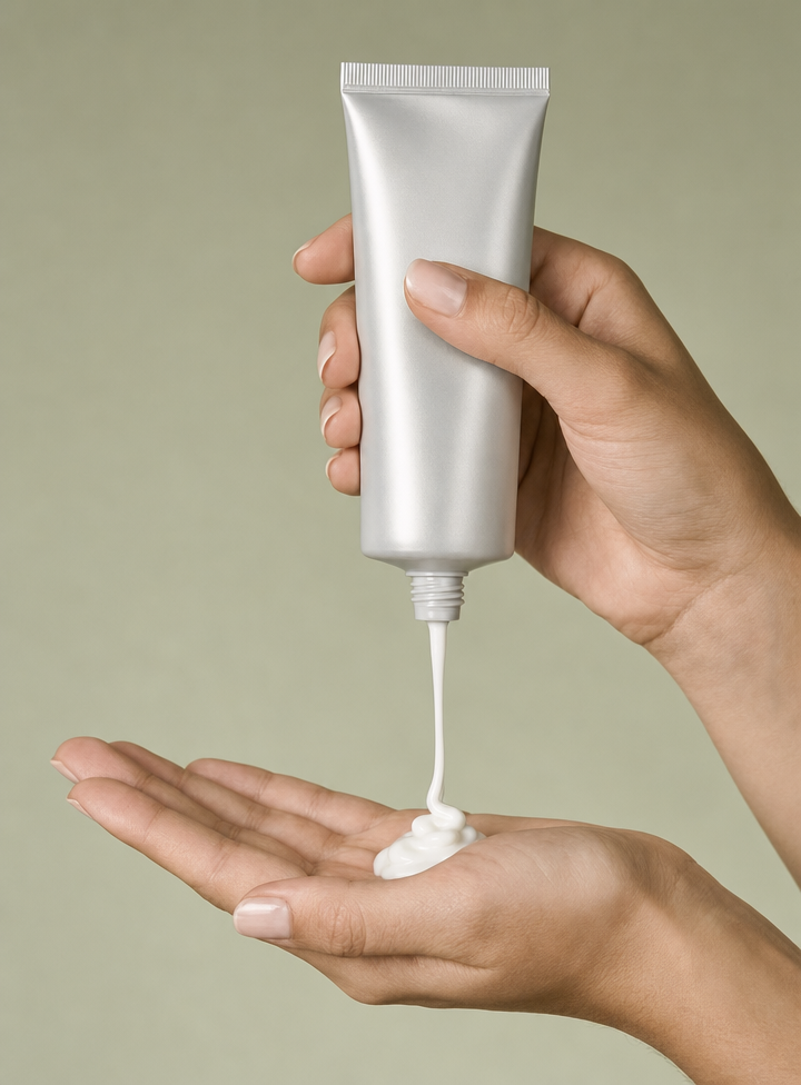
Silver BB cream tube dispensing into palm
