Why this works
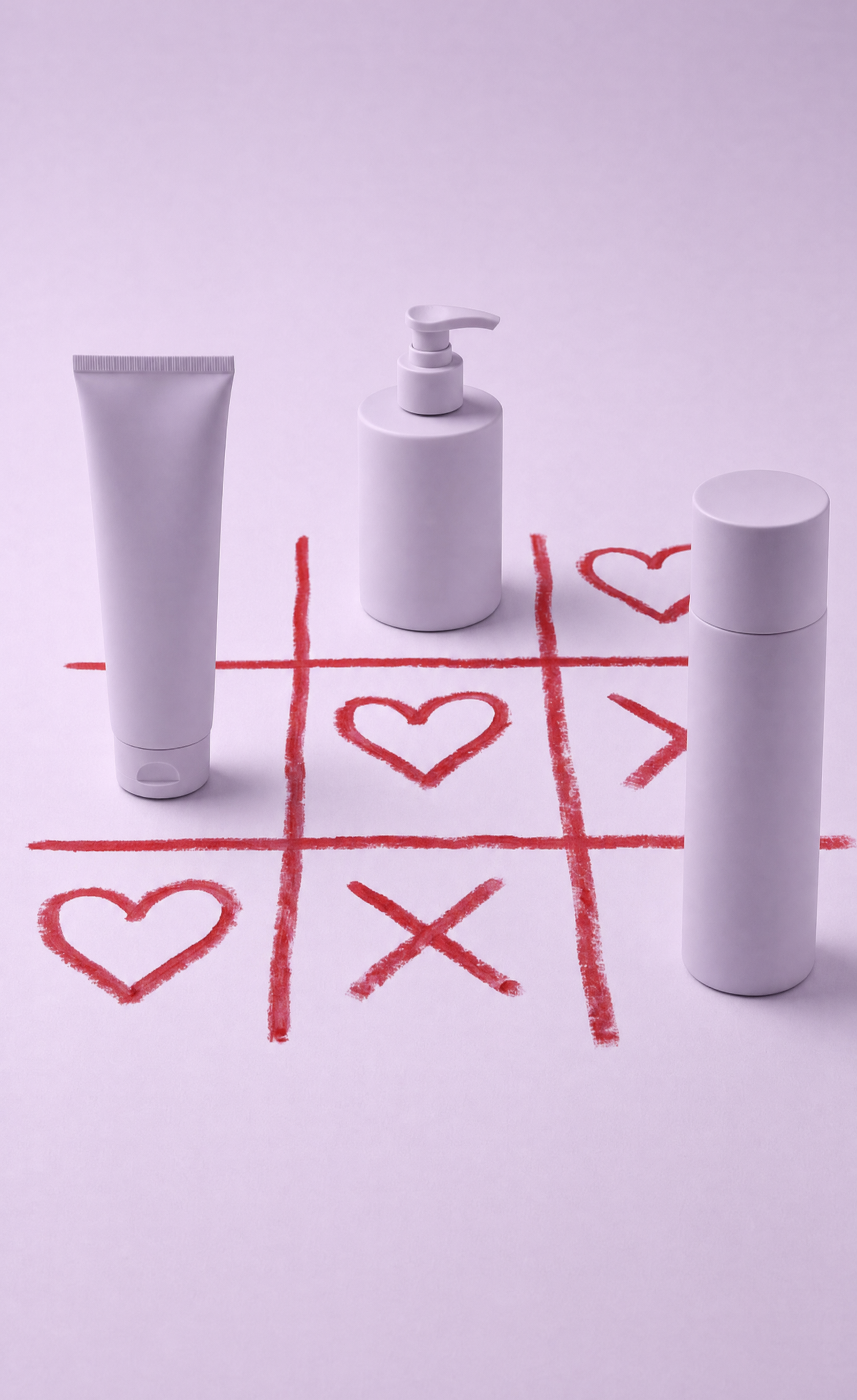
The phrase “three skincare containers ... arranged around a hand-drawn red tic-tac-toe grid with hearts and an X” gives the overhead flatlay a clear graphic centerpiece and a playful Valentine narrative. “Pale lavender background” paired with the dominant pink and red creates a soft, coordinated palette, while “gentle diffused lighting” and “soft natural shadows” keep the mood romantic without losing label readability. “90mm product perspective,” “close commercial framing,” and “shallow depth of field” establish a polished product-shot hierarchy, with “high-detail labels and accurate reflections” supplying the realism.
FAQ
→How do I make one skincare container the clear focal point?
Replace “three skincare containers ... arranged around” with “one pump bottle centered in the foreground, with one tube and one cylindrical bottle smaller and farther behind.” Keep “close commercial framing,” but change “shallow depth of field” to “very shallow depth of field, pump bottle label in crisp focus” so the central package dominates.
→How do I shift this from soft Valentine romance to a bolder, more energetic campaign?
Replace “soft romantic, playful Valentine-inspired styling” with “bold, graphic celebratory styling,” and change “pale lavender background” to “hot pink background with saturated red accents.” Replace “gentle diffused lighting with soft shadows” with “crisp directional studio lighting with defined shadows” for stronger contrast.
→How do I create a coordinated series of variations from this composition?
Keep “90mm product perspective, close commercial framing,” “minimal studio composition,” and “overhead flatlay” unchanged, then swap the centerpiece phrase “red tic-tac-toe grid with hearts and an X” for themed graphics such as “blue hand-drawn crossword grid with stars” or “green hand-drawn botanical diagram with leaves.” Replace “pale lavender background” and the pink/red palette with one matching background-and-accent pair for each campaign.
Learn the technique behind this
- Why can't AI spell, and how do I get readable text in an image? — Older diffusion models had no character-level representation of text, so they produced letterform-shaped texture instead of words.
- How do I keep one consistent style across a whole set of images? — Style consistency is more achievable than character consistency because style lives in describable attributes.
- How should a prompt be structured, and does word order matter? — A prompt that behaves predictably names one subject first, then what it is doing, then where, then the light, then the lens or medium, then the style.
Related prompts

Playful brunette beauty ad portrait

Red Lip Balm with Lychee Freshness

Premium wellness pouch with golden spices

Teal-Accented Bunny Toy Studio Portrait
