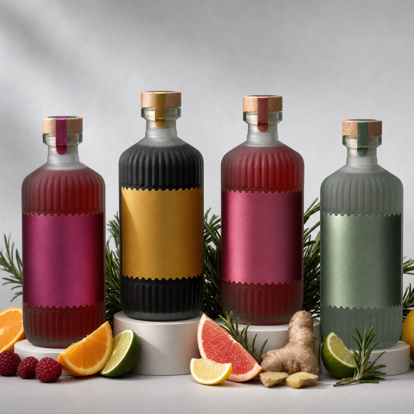
Why this works
The centered lineup of “four premium non-alcoholic beverage bottles” on “matte white pedestals” gives the image a controlled, catalog-like composition, while “sharp focus on bottle labels and glass texture” makes the packaging the visual anchor. “Richer jewel tones (emerald, sapphire, ruby, and amber accents)” adds premium color contrast, though the generated image’s dominant red, pink, and black skew the palette toward a warmer, more dramatic finish. “Soft diffused lighting,” “realistic shadows,” and “crisp reflections” preserve the clean studio mood while making the ribbed glass and cork tops feel tactile rather than flat.
FAQ
→How do I make the bottles feel more luxurious and less dominated by red, pink, and black?
Replace “richer jewel tones (emerald, sapphire, ruby, and amber accents)” with “balanced emerald, sapphire, ruby, and amber labels, with emerald and sapphire as the dominant colors and restrained ruby accents.” Add “no black labels or hot-pink color cast” to keep the palette aligned with the intended jewel-tone range.
→How do I make the citrus and rosemary more visually central?
Replace “replace the foreground ingredients with fresh citrus wedges and rosemary sprigs” with “a generous foreground arrangement of sliced lemon, blood orange, lime, and rosemary sprigs framing the bottle bases.” Change “sharp focus on bottle labels and glass texture” to “sharp focus across the front ingredients and bottle labels” so the garnish shares attention with the packaging.
→How do I turn this into a consistent series of flavor variations?
Keep “photorealistic commercial product photography,” “neat lineup on matte white pedestals,” and “cooler light gray backdrop” unchanged, then replace “four premium non-alcoholic beverage bottles in assorted flavors” with a fixed flavor-specific set such as “four bottles from one botanical citrus collection: blood orange, lemon rosemary, grapefruit sage, and lime mint.” For each variation, change the label accents and foreground garnish together while preserving “ribbed clear glass bottles with cork tops” and the same centered studio framing.
Learn the technique behind this
- Why can't AI spell, and how do I get readable text in an image? — Older diffusion models had no character-level representation of text, so they produced letterform-shaped texture instead of words.
- How should a prompt be structured, and does word order matter? — A prompt that behaves predictably names one subject first, then what it is doing, then where, then the light, then the lens or medium, then the style.
- Do negative prompts work, and what should go in one? — Negative prompts work on models that support a separate negative conditioning channel — mainly Stable Diffusion and FLUX-family models.
Related prompts

Playful brunette beauty ad portrait

Red Lip Balm with Lychee Freshness

Premium wellness pouch with golden spices

Teal-Accented Bunny Toy Studio Portrait
