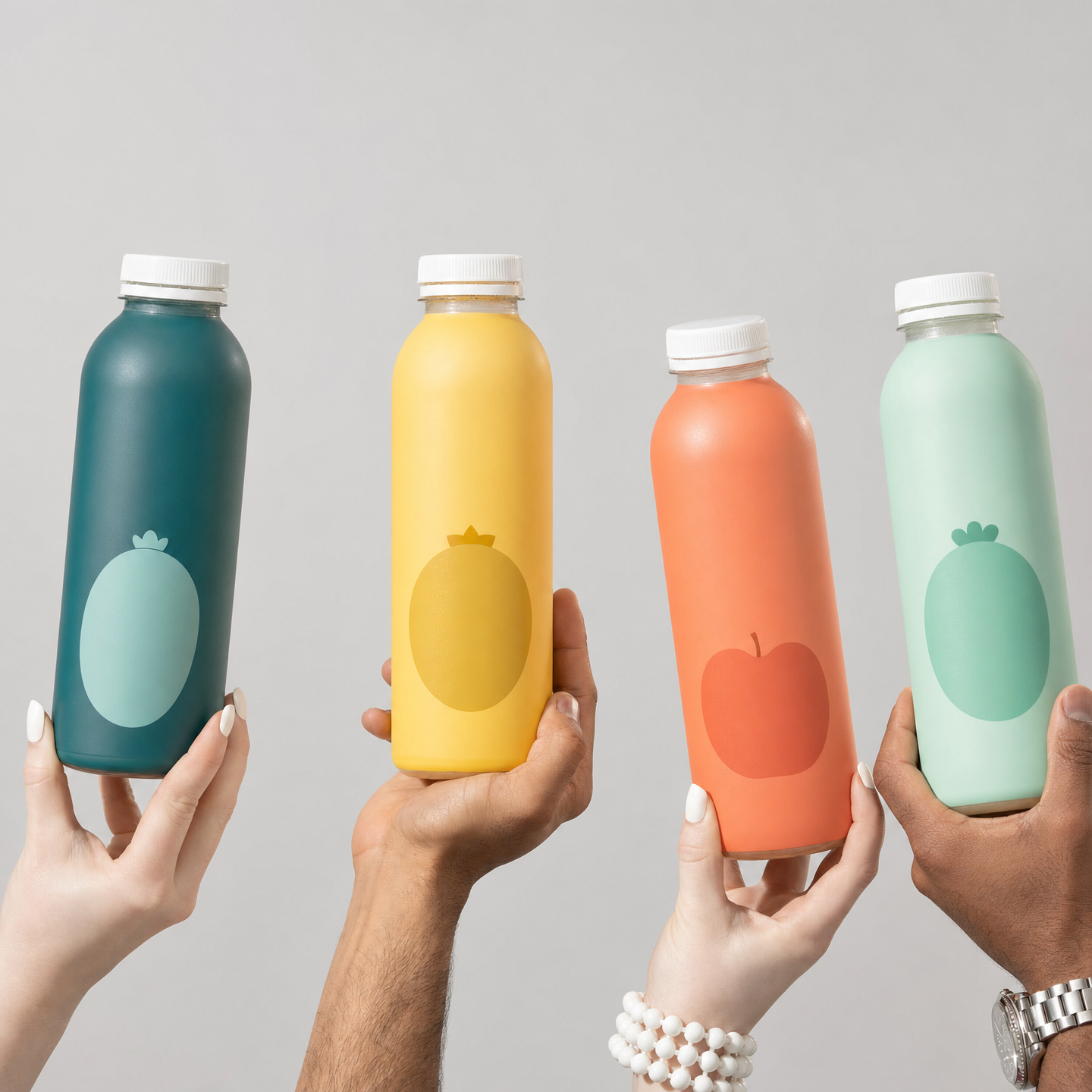
Why this works
“Four colorful juice bottles held upright by hands” gives the image a centered, human-scaled product lineup, while “front-facing composition” keeps each label area equally readable even without text. The color sequence “deep teal, sunny yellow, coral orange, and mint green” supplies a clear teal-yellow-orange-green rhythm against the “smooth medium-warm light gray background,” creating contrast without a busy setting. “Soft, even illumination,” “subtle shadow separation,” and “crisp realistic glass highlights” define the clean commercial mood, while “ultra-detailed, sharp focus on the bottles and the hands” makes both the packaging and gesture carry visual weight.
FAQ
→How do I make one bottle more central and prominent?
Replace “four colorful juice bottles” with “one large hero juice bottle in deep teal centered in the foreground, with three smaller bottles in sunny yellow, coral orange, and mint green arranged behind it.” Change “front-facing composition” to “center-weighted hero product composition” and add “shallow depth of field isolating the central bottle.”
→How do I shift this from a clean studio mood to a brighter, more energetic advertisement?
Replace “smooth medium-warm light gray background” with “bright white-to-pastel gradient background with playful color blocks,” and replace “soft, even illumination” with “bright high-key studio lighting with vivid specular highlights.” Keep “deep teal, sunny yellow, coral orange, and mint green,” but add “dynamic diagonal arrangement” instead of the centered layout to increase energy.
→How do I create a series of variations using different juice flavors or settings?
Keep “photorealistic commercial product photography,” “crisp realistic glass highlights,” and “no readable text or logos” fixed as the series rules. Swap “four colorful juice bottles” for a specific flavor set such as “four berry juice bottles in raspberry, blueberry, blackberry, and strawberry colorways,” or replace the studio setting with “sunlit kitchen counter with fresh fruit props” while changing “smooth light gray background” to “warm natural home interior background.”
Learn the technique behind this
- Why can't AI spell, and how do I get readable text in an image? — Older diffusion models had no character-level representation of text, so they produced letterform-shaped texture instead of words.
- How do I keep one consistent style across a whole set of images? — Style consistency is more achievable than character consistency because style lives in describable attributes.
- Why does the model ignore parts of my prompt? — Ignored instructions are almost always conflicts, counts, or spatial relationships — three things current models handle badly — rather than the model failing to read you.
Related prompts

Playful brunette beauty ad portrait

Red Lip Balm with Lychee Freshness

Premium wellness pouch with golden spices

Teal-Accented Bunny Toy Studio Portrait
