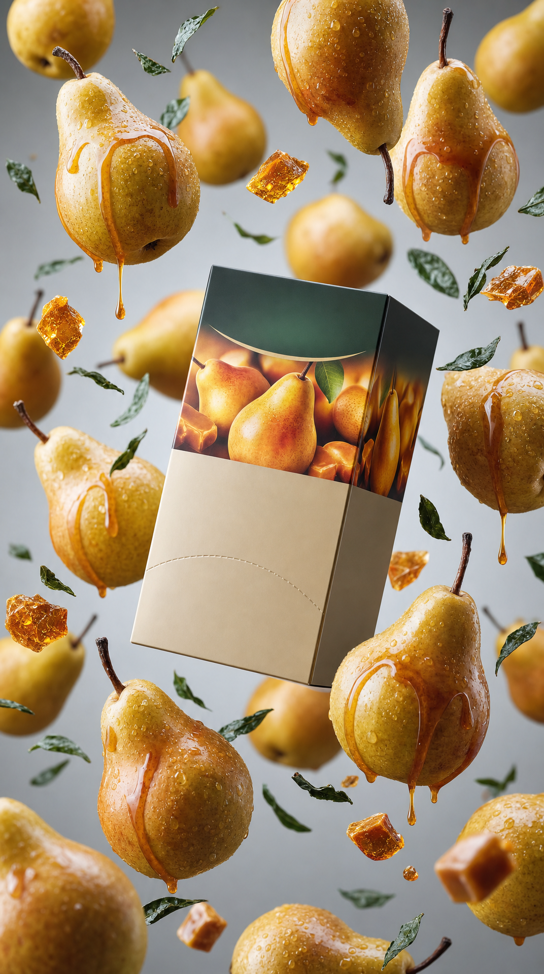
Why this works
The centered “Greenfield Caramel Pear tea box” and “product hero shot, centered composition” make the package the immediate focal point, while “glossy ripe pears, amber caramel shards, and scattered loose tea leaves” build a controlled ingredient frame around it. “Cool light-gray backdrop with a subtle vignette” provides clean separation, and “soft diffused studio lighting with gentle highlights and realistic reflections” gives the gold, brown, and green palette a polished commercial finish. The phrase “ingredients appear suspended in a natural floating arrangement” adds depth and motion without disrupting the crisp, centered advertising layout.
FAQ
→How do I make the tea box feel more dominant than the floating ingredients?
Keep “Greenfield Caramel Pear tea box floating in the center,” but replace “surrounded by glossy ripe pears, amber caramel shards, and scattered loose tea leaves” with “ingredients smaller and positioned behind the box, leaving a clear foreground silhouette.” Add “tea box occupies 60 percent of the frame” and “shallow depth of field on background ingredients.”
→How do I shift this from warm premium advertising to a darker autumn mood?
Replace “cool light-gray backdrop with a subtle vignette” with “deep charcoal-brown studio backdrop with a stronger edge vignette,” and change “soft diffused studio lighting” to “directional low-key side lighting with warm amber highlights and deep shadows.” Keep “caramel golds and pear greens,” but add “muted olive greens and dark roasted-brown tones.”
→How do I create a series of packaging variations while preserving this composition?
Keep “product hero shot, centered composition, crisp commercial framing,” “soft diffused studio lighting,” and “ingredients appear suspended in a natural floating arrangement.” Swap “Greenfield Caramel Pear tea box” for alternatives such as “Greenfield Apple Cinnamon tea box,” replace the ingredient phrase with “glossy apple slices, cinnamon sticks, and loose tea leaves,” and change “caramel golds and pear greens” to “cinnamon browns, apple reds, and muted greens.”
Learn the technique behind this
- Why can't AI spell, and how do I get readable text in an image? — Older diffusion models had no character-level representation of text, so they produced letterform-shaped texture instead of words.
- How should a prompt be structured, and does word order matter? — A prompt that behaves predictably names one subject first, then what it is doing, then where, then the light, then the lens or medium, then the style.
- Do negative prompts work, and what should go in one? — Negative prompts work on models that support a separate negative conditioning channel — mainly Stable Diffusion and FLUX-family models.
Related prompts

Playful brunette beauty ad portrait

Red Lip Balm with Lychee Freshness

Premium wellness pouch with golden spices

Teal-Accented Bunny Toy Studio Portrait
