Why this works
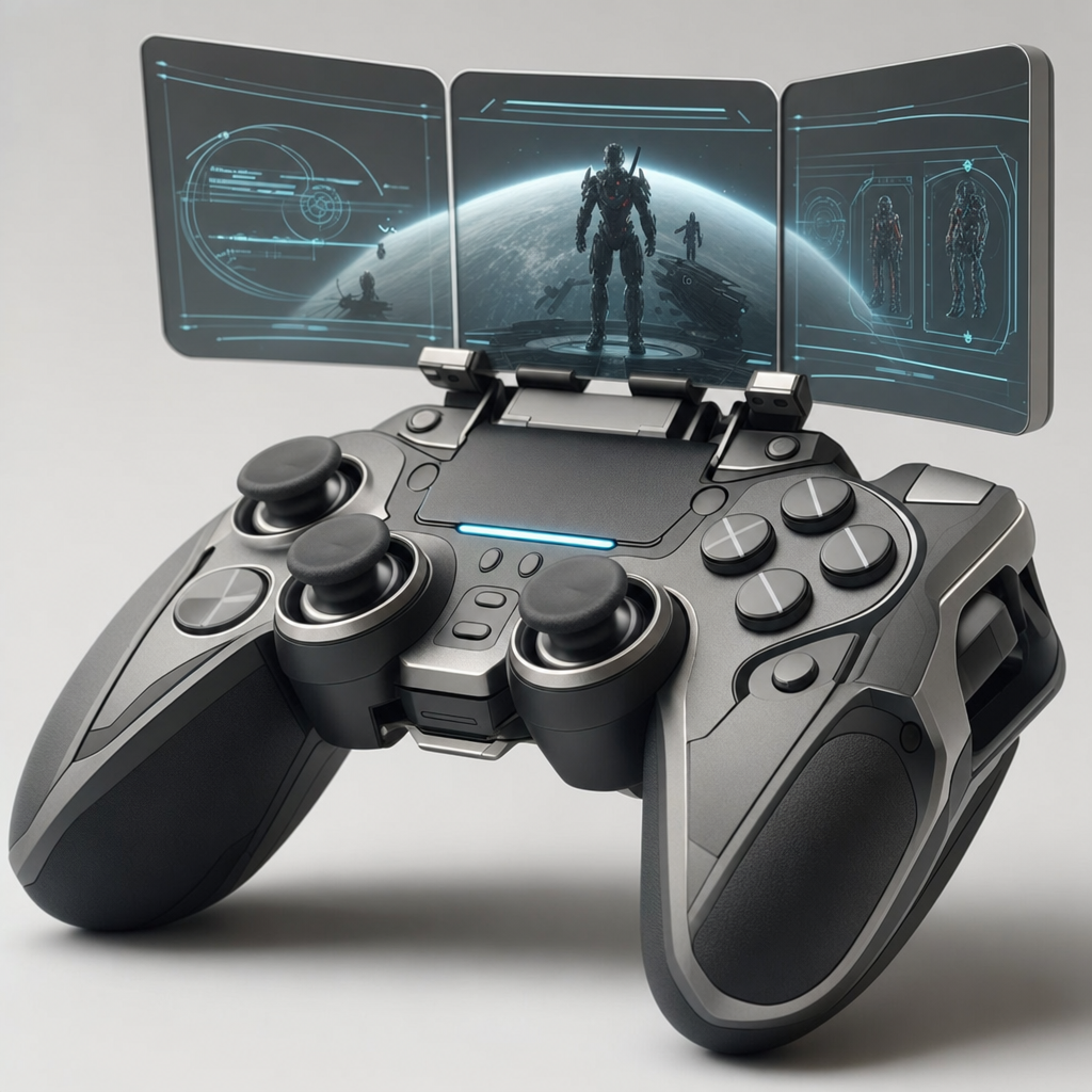
The “straight-on nearly centered framing” makes the controller a stable product hero, while the “three holographic display panels hover in a shallow arc” adds a controlled futuristic layer above it. “Matte graphite black grips,” “brushed titanium-silver accents,” and the “single light-blue status strip glow” create a restrained black, blue, and white palette, with “subtle cyan linework” reinforcing the high-tech mood without overwhelming the white studio. “Cinematic studio lighting with gentle highlights and controlled falloff,” combined with “ultra-detailed surface reflections” and a “soft realistic shadow under the controller,” supplies dimensionality while preserving the clean mockup presentation.
FAQ
→How do I make the holographic displays more central and prominent?
Replace “three holographic display panels hover in a shallow arc” with “three large holographic display panels dominate the upper half of the composition in a deep arc,” and change “subtle cyan linework” to “bright cyan interface graphics with readable icons and layered translucent data.” Keep “straight-on nearly centered framing” if the controller should remain symmetrical beneath them.
→How do I change the sleek product mood into a darker cyberpunk tone?
Replace “clean white studio background” with “dark charcoal studio environment with a faint urban-tech backdrop,” and replace “cinematic studio lighting with gentle highlights and controlled falloff” with “dramatic blue and magenta rim lighting with deep shadows.” Change “single light-blue status strip glow” to “intense electric-blue and magenta status lighting” for a stronger cyberpunk color contrast.
→How do I build a series of controller variations from this prompt?
Keep the fixed structure, including “high-end product photography, straight-on nearly centered framing,” “soft realistic floor shadow,” and “three holographic display panels,” then swap the material and accent phrases for each version. For example, replace “matte graphite black grips and brushed titanium-silver accents” with “pearl-white grips and polished copper accents,” or “deep navy grips and anodized violet accents,” while changing “light-blue status strip glow” to “warm amber status strip glow” or “violet status strip glow.”
Learn the technique behind this
- Why can't AI spell, and how do I get readable text in an image? — Older diffusion models had no character-level representation of text, so they produced letterform-shaped texture instead of words.
- How should a prompt be structured, and does word order matter? — A prompt that behaves predictably names one subject first, then what it is doing, then where, then the light, then the lens or medium, then the style.
- Do negative prompts work, and what should go in one? — Negative prompts work on models that support a separate negative conditioning channel — mainly Stable Diffusion and FLUX-family models.
Related prompts

Playful brunette beauty ad portrait

Red Lip Balm with Lychee Freshness

Teal-Accented Bunny Toy Studio Portrait

Premium wellness pouch with golden spices