Why this works
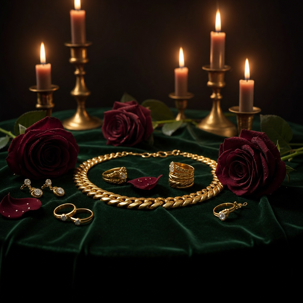
“Chunky gold jewelry arranged atop dark emerald velvet” establishes the green-and-gold color harmony, while “deep burgundy roses” adds a controlled crimson accent. The overhead-flatlay and “square composition” keep the arrangement graphic and easy to read, with “sharp focus on jewelry and velvet textures” making the metal and fabric the visual anchors. “Dramatic high-contrast lighting,” “soft smoky candlelight,” and “dark, romantic atmosphere” specifically create the seductive, low-key mood; “crisp micro-textures” supplies the tactile luxury finish.
FAQ
→How do I make the jewelry more central and visually dominant?
Replace “surrounded by deep burgundy roses and soft smoky candlelight” with “minimal burgundy rose petals and two distant candlelight accents,” and change “sharp focus on jewelry and velvet textures” to “tight central focus on the jewelry, with velvet, roses, and candles falling into soft peripheral blur.”
→How do I turn this into a brighter, cleaner luxury campaign image?
Replace “dark emerald velvet” with “pale ivory velvet,” “deep burgundy roses” with “soft blush roses,” and “moody candlelight with dramatic high contrast and a subtle smoky glow” with “bright diffused daylight with soft editorial shadows and no smoke.” Keep “photorealistic” and “elegant studio product styling” to preserve the polished product-photography character.
→How do I create a coordinated series using different jewelry and color palettes?
Keep “overhead-flatlay,” “square composition,” “elegant studio product styling,” and “crisp micro-textures” unchanged, then swap “chunky gold jewelry” for a consistent subject pattern such as “sculptural silver jewelry” and replace “dark emerald velvet” and “deep burgundy roses” with a new pair such as “midnight-blue velvet and cobalt flowers.” Match the lighting phrase to each palette, for example replacing “soft smoky candlelight” with “cool moonlit highlights” for the blue variation.
Related prompts

Playful brunette beauty ad portrait
Teal Ditto in a blister display
Guerlain cosmetics in cool neutral studio
White square plinth in wildflower meadow