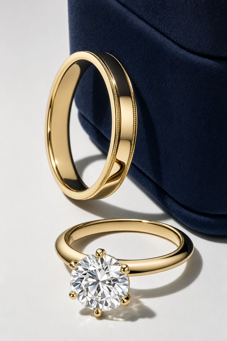
Why this works
The overhead flatlay framing and “clean light-gray studio backdrop” give the rings and pouch a controlled catalog layout, while “polished gold bands” and “white-gold diamond solitaire” create a deliberate warm-versus-cool metal contrast against the dominant navy, white, and gray palette. “Soft daylight-balanced studio lighting,” “crisp reflections,” and “a soft shadow” preserve the jewelry’s reflective surfaces while keeping the mood elegant rather than dramatic. “Ultra-detailed macro realism” and “shallow depth of field” make facets, metal polish, and fabric texture carry the visual focus.
FAQ
→How do I make the diamond solitaire more central and prominent?
Replace “arranged beside a deep navy fabric pouch” with “the white-gold diamond solitaire engagement ring centered in the foreground, with polished gold bands and the deep navy fabric pouch receding behind it,” and change “overhead-flatlay” to “slightly elevated three-quarter product view.” Keep “ultra-detailed macro realism” to retain attention on the stone.
→How do I shift this from a clean catalog mood to a darker, more dramatic luxury image?
Replace “clean light-gray background” with “deep charcoal velvet background” and “soft daylight-balanced lighting” with “directional low-key spotlighting from the upper left.” Change “a soft shadow” to “long, controlled shadows” while keeping “crisp reflections” for defined highlights on the gold and diamond.
→How do I create a coordinated series with different jewelry and pouch colors?
Keep “luxury jewelry catalog styling,” “overhead-flatlay,” and “ultra-detailed macro realism” unchanged, then swap “polished gold bands and a white-gold diamond solitaire engagement ring” for each new jewelry set and replace “deep navy fabric pouch” with a fixed color sequence such as “burgundy,” “forest green,” and “ivory.” Use the same “clean light-gray studio backdrop” and “soft daylight-balanced lighting” in every variation for consistent comparison.
Learn the technique behind this
- Why can't AI spell, and how do I get readable text in an image? — Older diffusion models had no character-level representation of text, so they produced letterform-shaped texture instead of words.
- How should a prompt be structured, and does word order matter? — A prompt that behaves predictably names one subject first, then what it is doing, then where, then the light, then the lens or medium, then the style.
- Do negative prompts work, and what should go in one? — Negative prompts work on models that support a separate negative conditioning channel — mainly Stable Diffusion and FLUX-family models.
Related prompts

Playful brunette beauty ad portrait

Red Lip Balm with Lychee Freshness

Premium wellness pouch with golden spices

Teal-Accented Bunny Toy Studio Portrait
