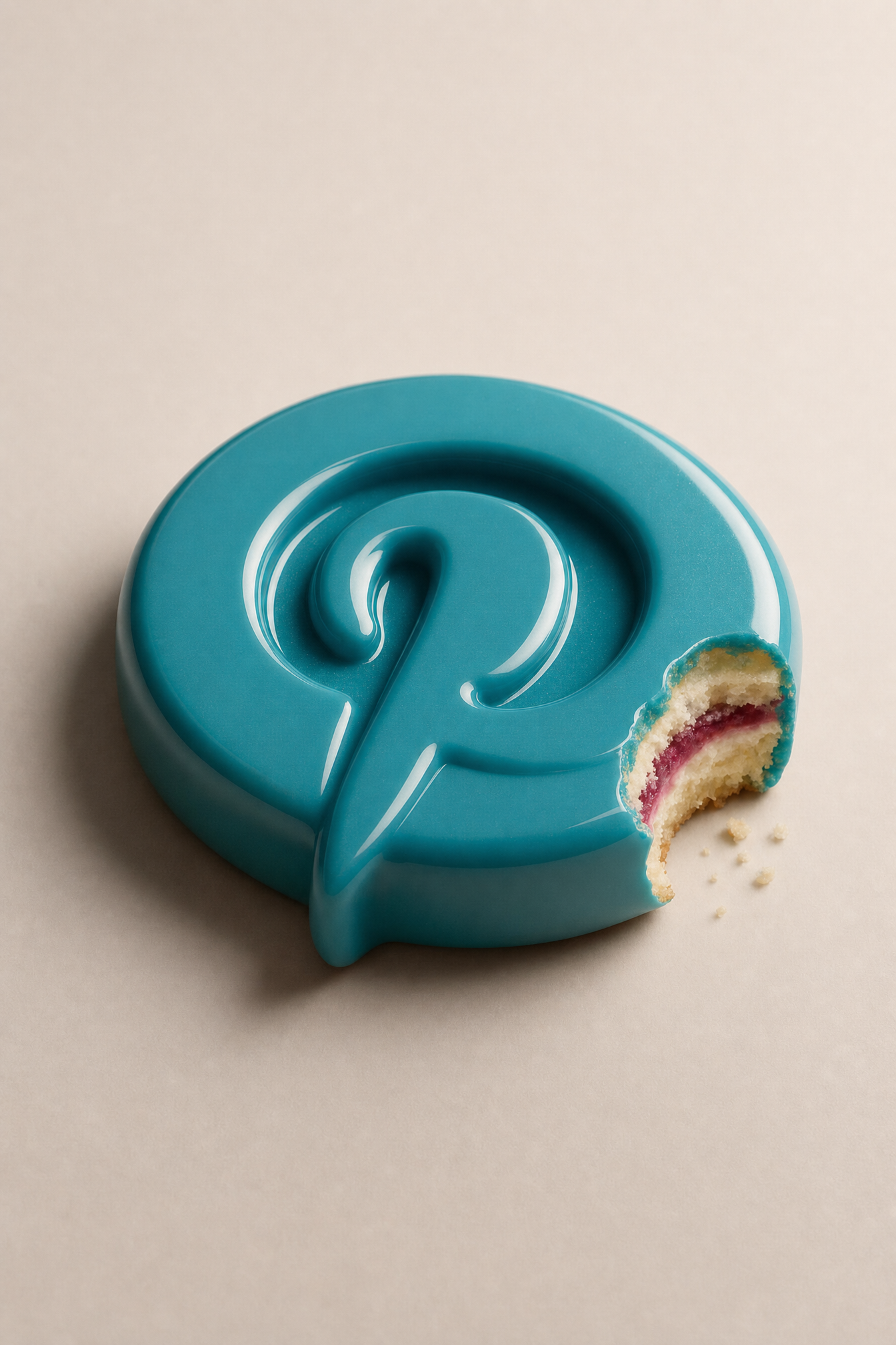
Why this works
The centered composition and “smooth warm-white studio background” give the bitten teal logo a controlled, icon-like presence, while the dominant beige background softens the otherwise bright “glossy teal” surface. The playful contrast comes from “a small bite mark revealing a dessert-like interior of raspberry cream and vanilla sponge layers,” and “soft shadows, crisp glossy reflections” supplies the polished product-advertising finish without losing the clean “shallow depth of field” focus on the logo.
FAQ
→How do I make the dessert interior more central and visually prominent?
Replace “a small bite mark” with “a large foreground bite exposing the interior,” and change “raspberry cream and vanilla sponge layers” to “thick, clearly separated raspberry cream and vanilla sponge layers with visible crumbs.” Add “interior in sharp focus” after “shallow depth of field” so the filling does not become a minor detail.
→How do I shift this from a clean premium ad into a more playful candy-like image?
Replace “clean modern tech-advertising aesthetic” with “bright whimsical confectionery advertising aesthetic,” and change “smooth warm-white studio background” to “pastel pink studio background with scattered candy sprinkles.” Swap “soft shadows” for “soft colorful shadows” while keeping “crisp glossy reflections” to preserve the logo’s toy-like shine.
→How do I build a series using different logo subjects while keeping the same visual system?
Replace “a glossy teal 3D social-media-style logo” with a variable subject such as “a glossy coral 3D music-note logo” or “a glossy cobalt 3D chat-bubble logo,” and keep “lying on a smooth warm-white studio background,” “soft shadows, crisp glossy reflections,” and “shallow depth of field” unchanged. For consistent dessert variations, replace “raspberry cream and vanilla sponge layers” with fillings such as “lemon curd and pistachio cake” while retaining “a small bite mark revealing a dessert-like interior.”
Learn the technique behind this
- Why can't AI spell, and how do I get readable text in an image? — Older diffusion models had no character-level representation of text, so they produced letterform-shaped texture instead of words.
- How do I keep one consistent style across a whole set of images? — Style consistency is more achievable than character consistency because style lives in describable attributes.
- How should a prompt be structured, and does word order matter? — A prompt that behaves predictably names one subject first, then what it is doing, then where, then the light, then the lens or medium, then the style.
Related prompts

Playful brunette beauty ad portrait

Red Lip Balm with Lychee Freshness

Premium wellness pouch with golden spices

Teal-Accented Bunny Toy Studio Portrait
