Why this works
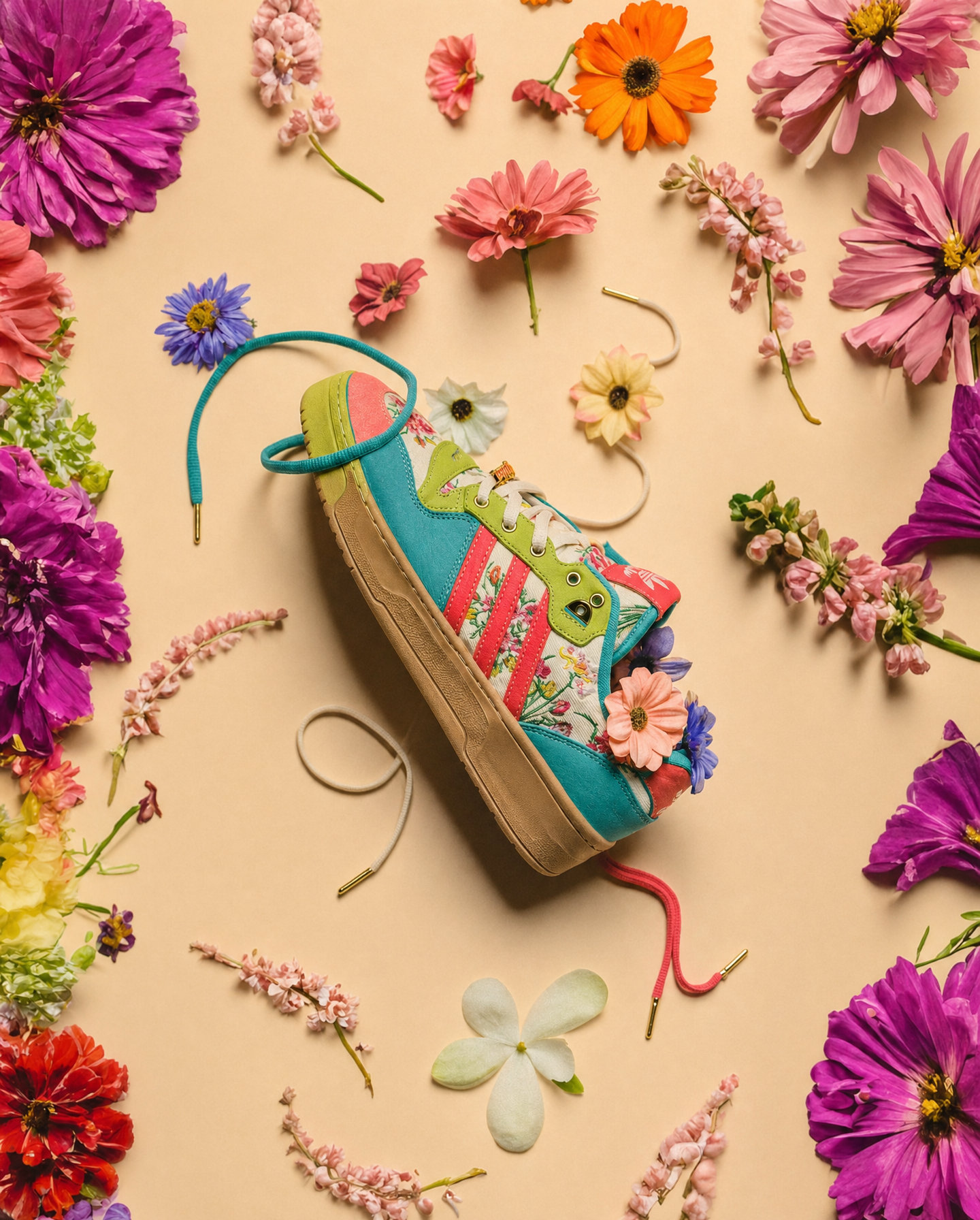
“Top-down view, flat-lay product framing” makes the sneaker the graphic centerpiece while the scattered flowers and loose petals build a controlled perimeter around it. The warm-beige background gives the dominant purple, pink, teal, and blue hues a neutral field, while “teal, lime green, and bright coral” paired with “contrasting blue-violet tones” creates the playful color tension. “Crisp studio lighting with soft natural shadows” preserves a polished editorial mood without flattening the highly detailed sneaker materials.
FAQ
→How do I make the sneaker more visually dominant?
Replace “a colorful custom sneaker surrounded by scattered fresh flowers and loose petals” with “a colorful custom sneaker occupying most of the frame, with a sparse ring of flowers and petals near the edges.” Keep “top-down view, flat-lay product framing,” but reduce the floral elements so the shoe has more negative space and visual weight.
→How do I shift this from playful and vibrant to a darker, moodier editorial image?
Replace “clean warm-beige background” with “deep charcoal-gray background,” and change “crisp studio lighting with soft natural shadows” to “directional low-key lighting with pronounced shadows.” Swap “vibrant but natural color balance” for “muted cinematic color grading,” while retaining small teal and coral accents for controlled contrast.
→How do I create a coordinated series of variations from this prompt?
Keep “top-down view, flat-lay product framing,” “photorealistic editorial product photography,” and “highly detailed materials” unchanged, then replace the accent phrase “teal, lime green, and bright coral” and the flower phrase “contrasting blue-violet tones” with matched palettes such as “cobalt blue, sunflower yellow, and white” with “flowers in deep orange tones.” Repeat the same structure with different palettes while preserving the warm-beige background and floral spacing.
Learn the technique behind this
- Why can't AI spell, and how do I get readable text in an image? — Older diffusion models had no character-level representation of text, so they produced letterform-shaped texture instead of words.
- How should a prompt be structured, and does word order matter? — A prompt that behaves predictably names one subject first, then what it is doing, then where, then the light, then the lens or medium, then the style.
- Why does the model ignore parts of my prompt? — Ignored instructions are almost always conflicts, counts, or spatial relationships — three things current models handle badly — rather than the model failing to read you.
Related prompts

Playful brunette beauty ad portrait

Red Lip Balm with Lychee Freshness

Premium wellness pouch with golden spices

Teal-Accented Bunny Toy Studio Portrait
