Why this works
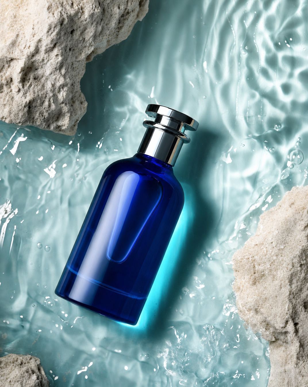
The centered bottle and “overhead top-down view, clean minimal framing” make the cobalt-blue vessel the immediate focal point, while “pale cream limestone rocks partially framing it” adds a controlled natural border without disrupting the symmetry. “Teal luminous water” supplies the cool blue-gray field seen across the image, and “dramatic high-contrast studio lighting” plus “crisp glossy reflections and subtle refractions through the glass” give the bottle its polished, premium dimensionality. The restrained palette of cobalt blue, teal, pale cream, and white supports the “elegant refreshing mood” more effectively than the commercial-style labels alone.
FAQ
→How do I make the perfume bottle feel larger and more central?
Keep “overhead top-down view” but replace “clean minimal framing” with “tight top-down crop with the bottle occupying 70% of the frame,” and change “floating on softly glowing teal water” to “large centered bottle dominating the water surface.” Reduce “pale cream limestone rocks partially framing it” to “small limestone accents at the extreme corners” so the rocks cannot compete with the subject.
→How do I shift this from a refreshing mood to a darker, more dramatic luxury mood?
Replace “softly glowing teal water” with “deep midnight-blue water with restrained reflective highlights,” and change “elegant refreshing mood” to “mysterious, opulent mood.” Keep “dramatic high-contrast studio lighting,” but specify “hard directional spotlight with deep surrounding shadows” instead of relying on the existing general lighting phrase.
→How do I create a coordinated series of variations from this prompt?
Preserve the fixed structure, including “overhead top-down view, clean minimal framing,” “dramatic high-contrast studio lighting,” and “premium commercial aesthetic,” then swap the subject color and setting together. For example, replace “cobalt-blue glass perfume bottle” and “teal water” with “amber glass perfume bottle” and “warm ivory water,” or with “smoky-violet glass perfume bottle” and “cool silver water,” while changing “pale cream limestone rocks” to a consistent material family such as “white marble fragments” across every variation.
Learn the technique behind this
- Why can't AI spell, and how do I get readable text in an image? — Older diffusion models had no character-level representation of text, so they produced letterform-shaped texture instead of words.
- Which aspect ratio should I use, and how does it change the image? — Aspect ratio determines what the model composes, not how it's cropped afterwards.
- How do I keep one consistent style across a whole set of images? — Style consistency is more achievable than character consistency because style lives in describable attributes.
Related prompts

Red Lip Balm with Lychee Freshness

Playful brunette beauty ad portrait

Premium wellness pouch with golden spices

Teal-Accented Bunny Toy Studio Portrait
