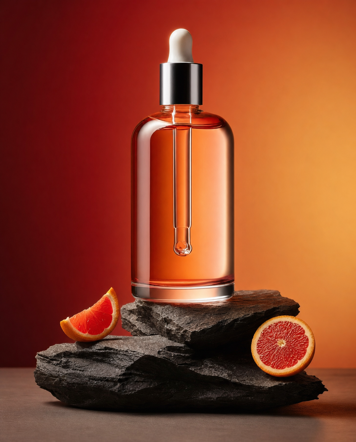
Why this works
The centered bottle, specified by “balanced, uncluttered composition” and “sharp focus on bottle and citrus,” gives the image a controlled commercial hierarchy, while the grapefruit segments provide a circular frame around the main product. “Deeper autumnal red-to-amber gradient background” supplies the dominant red warmth, and “rough natural slate rocks” add the brown-black tonal counterweight visible in the palette. “Studio lighting emphasizes realistic refraction and reflections in the glass,” reinforced by “crisp highlights on the bottle and dropper,” makes the transparent amber container the sharpest visual anchor without sacrificing the soft premium mood created by “soft shadows.”
FAQ
→How do I make the grapefruit more prominent than the bottle?
Replace “sharp focus on bottle and citrus” with “sharp focus on grapefruit segments, with the bottle slightly secondary,” and change “arranged around the bottle” to “large grapefruit segments in the foreground, partially overlapping and framing the bottle.” Keep “centered” if you want the fruit to dominate symmetrically, or use “bottle offset to the right” for a more editorial composition.
→How do I shift this from warm premium skincare to a cooler clinical look?
Replace “deeper autumnal red-to-amber gradient background” with “cool desaturated blue-gray gradient background,” and change “warm, clean, premium, modern” to “clinical, cool, minimal, modern.” Replace “soft shadows” with “cool directional studio shadows” while keeping “realistic refraction and reflections” so the glass remains the main technical feature.
→How do I create a series of matching product variations with different ingredients?
Keep the fixed structure, including “clean product still-life framing,” “centered,” “studio lighting,” and “balanced, uncluttered composition,” then replace “transparent amber glass serum bottle with a dropper cap” only when changing the package and replace “grapefruit segments” with ingredients such as “lemon slices,” “green tea leaves,” or “lavender sprigs.” Match each ingredient with a related background phrase, such as replacing “red-to-amber gradient” with “pale yellow-to-cream gradient” for lemon.
Learn the technique behind this
- Why can't AI spell, and how do I get readable text in an image? — Older diffusion models had no character-level representation of text, so they produced letterform-shaped texture instead of words.
- How should a prompt be structured, and does word order matter? — A prompt that behaves predictably names one subject first, then what it is doing, then where, then the light, then the lens or medium, then the style.
- Who owns an AI-generated image, and can I use it commercially? — Usage rights come from the provider's terms, and they generally let you use what you generate, including commercially.
Related prompts

Playful brunette beauty ad portrait

Red Lip Balm with Lychee Freshness

Premium wellness pouch with golden spices

Teal-Accented Bunny Toy Studio Portrait
