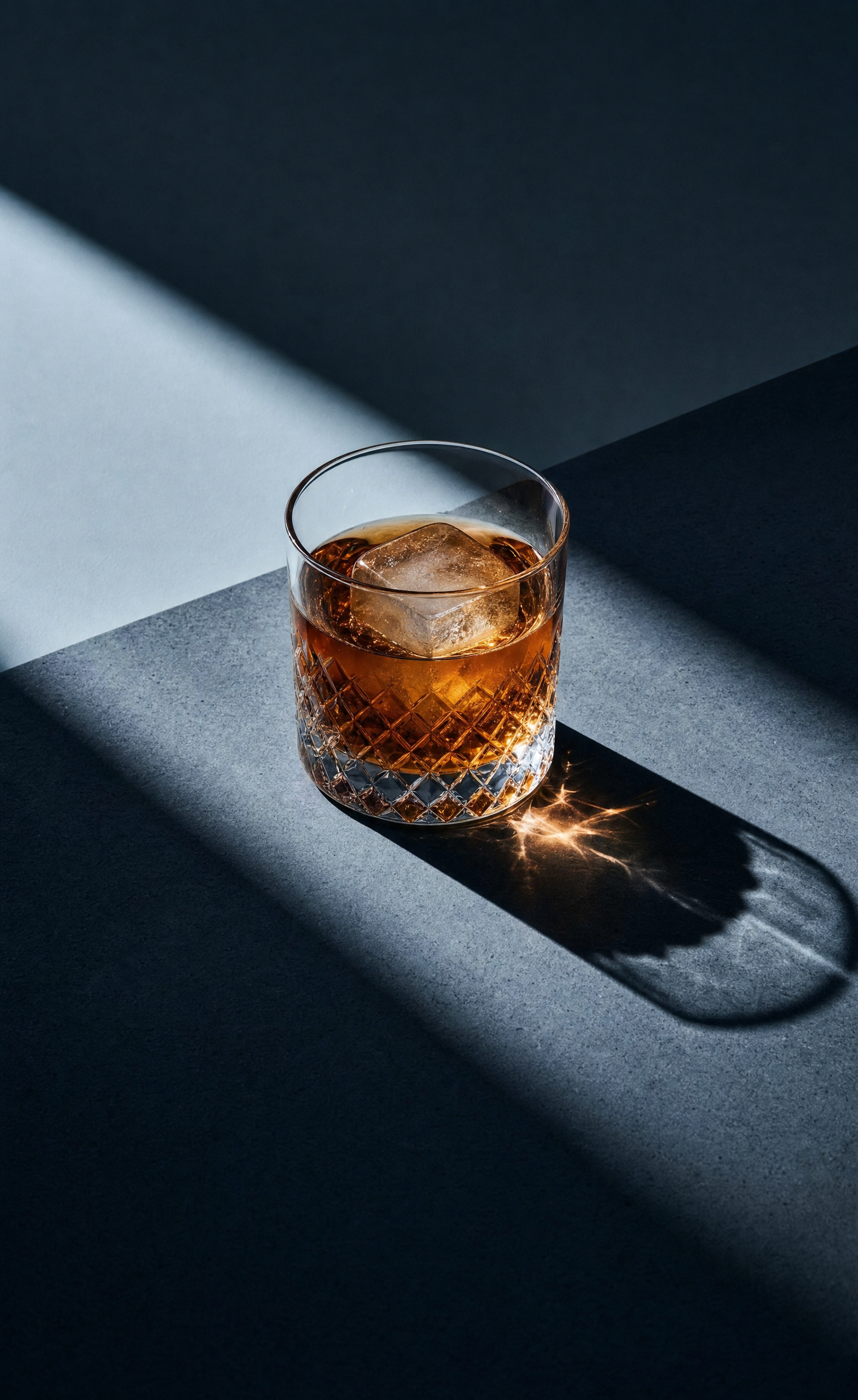
Why this works
The centered, controlled composition comes from “tumbler flush and perfectly aligned to the edge” and “straight-on top/side perspective feel,” while “one sharp diagonal shadow that interrupts the composition’s symmetry” adds a precise visual break. The black-and-amber palette is anchored by the “deep amber” cocktail against the rough slate and dark shadow, giving the frame its restrained luxury rather than relying on color alone. “Dramatic hard directional side beam,” “subtle highlights along the beveled rim,” and “no reflections” keep attention on the crystal edge and single ice cube while preserving the “fully matte, minimal surface finish.”
FAQ
→How do I make the cocktail more prominent without losing the minimalist framing?
Replace “centered” and “tumbler flush and perfectly aligned to the edge” with “tumbler slightly oversized and positioned in the lower center, with the cocktail occupying the visual focal point.” Keep “deep amber” and “single large ice cube,” but change “subtle highlights” to “a concentrated highlight through the amber liquid and ice cube” to draw focus inside the glass.
→How do I turn this into a warmer, more inviting variation?
Replace “cool slate-blue” with “muted warm charcoal-brown,” and change “dramatic hard directional side beam” to “soft warm side-light at late afternoon intensity.” Retain “no reflections” and “fully matte” so the warmer tone changes the mood without introducing glossy commercial styling.
→How do I build a series with different drinks while keeping this visual identity?
Keep “Photorealistic editorial still life,” “rough slate slab,” “one sharp diagonal shadow,” “seamless and tightly controlled,” and “fully matte, minimal surface finish” unchanged. Swap only “deep amber, low-profile negroni-style cocktail” and its color description for variations such as “pale straw martini with a lemon twist,” “ruby-red boulevardier with one large ice cube,” or “clear gin cocktail with a single green olive,” adjusting the background from “dusty taupe-grey to cool slate-blue” to a pair of tones that contrast the new drink.
Learn the technique behind this
- Why can't AI spell, and how do I get readable text in an image? — Older diffusion models had no character-level representation of text, so they produced letterform-shaped texture instead of words.
- How should a prompt be structured, and does word order matter? — A prompt that behaves predictably names one subject first, then what it is doing, then where, then the light, then the lens or medium, then the style.
- Why does the model ignore parts of my prompt? — Ignored instructions are almost always conflicts, counts, or spatial relationships — three things current models handle badly — rather than the model failing to read you.
Related prompts

Playful brunette beauty ad portrait

Red Lip Balm with Lychee Freshness

Premium wellness pouch with golden spices

Teal-Accented Bunny Toy Studio Portrait
